130 Years. One Formula. Zero Rewrites....Dr. UV's "UV" & "UVC" Post 523_041426_Tues_1:11am

======
130 Years. One Formula. Zero Rewrites.
Dr. UV’s “UV” & “UVC” Post 523_041426_Tues_1:11am
=======
Last week I showed you 20 years of the Dow on a single screen, mapped with UV and UVC. The response was immediate — readers wanted more history, more decades, more proof.
So I pushed the same two-number framework backwards. Not 20 years. Not 50. 130 years.
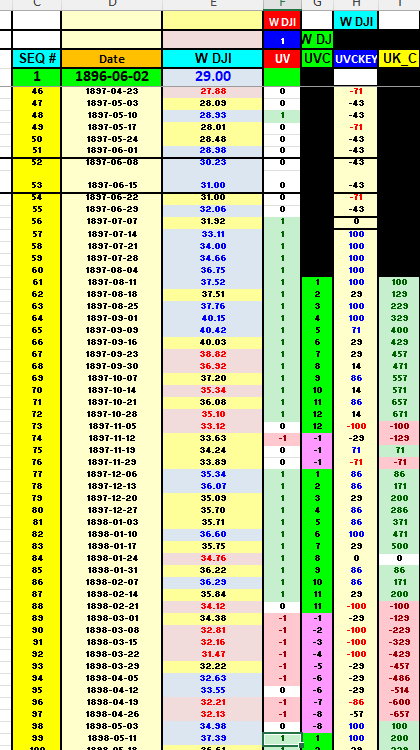
Every weekly close of the Dow Jones Industrial Average from 1897 to 2026. Through the Panic of 1907. Through the 1929 crash. Through WWII. Through stagflation. Through the dot-com collapse. Through the 2008 GFC. Through COVID. Through the 2022 bear.
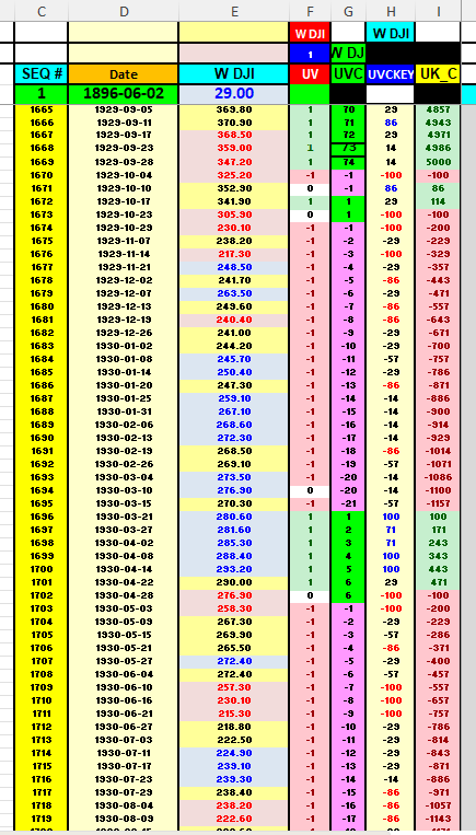
Same formula. Same chart. Same two numbers.
Not a single parameter re-tuned.
What You’re Looking At
The image above is one of three companion workbooks I built this week. Each one covers roughly 43 years of weekly UVC data, stacked year-over-year in a single grid:
I am going to give you some snippets:
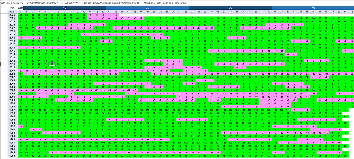
Book 1: 1983–2026 — the modern era (GFC, COVID, 2022 bear)
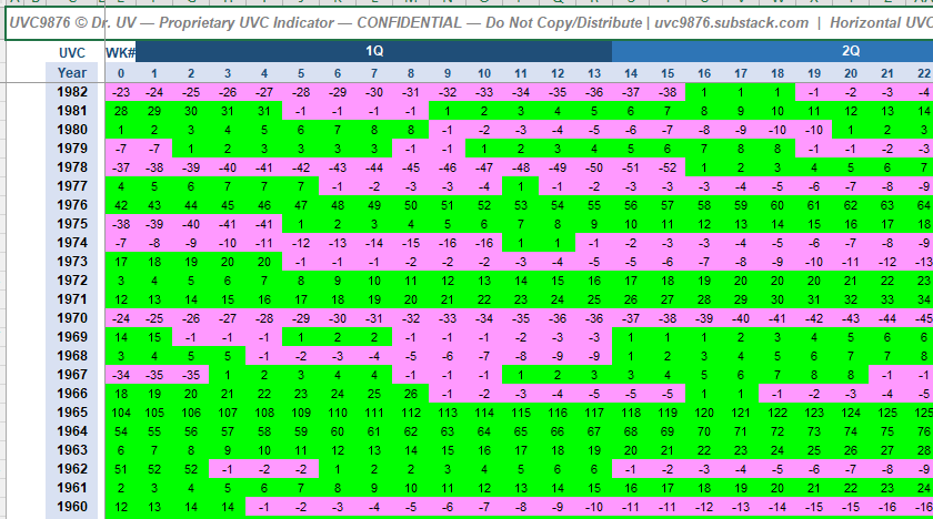
Book 2: 1940–1982 — post-WWII through stagflation
Book 3: 1897–1939 — the Panic of 1907, the 1929 crash, the Great Depression
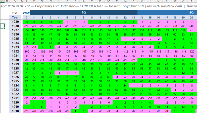
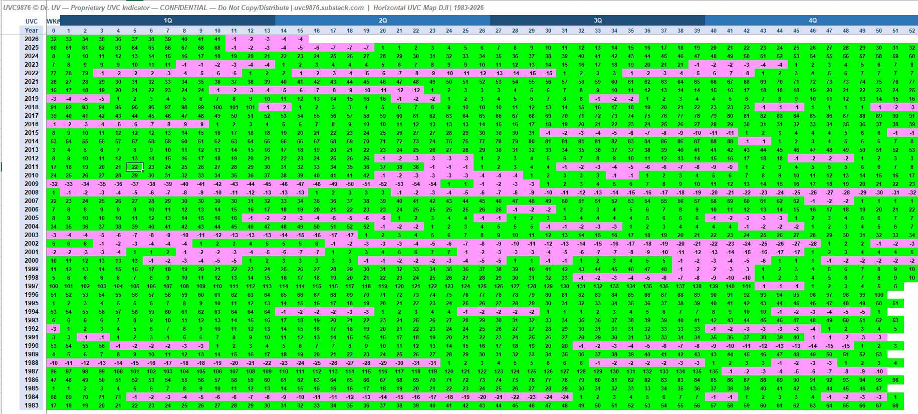
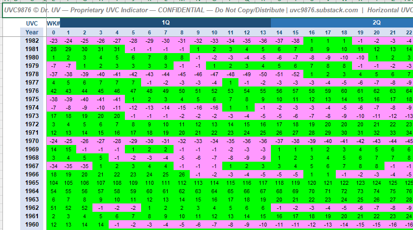
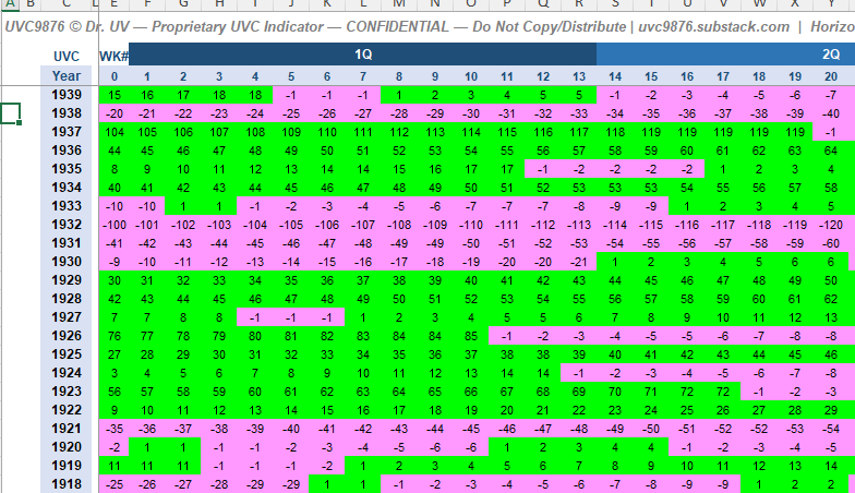
Each row is one calendar year. Each column is one week (0 through 53, with quarter boundaries marked). Each cell is the UVC value for that week — vibrant green for positive streaks, vibrant magenta for negative streaks.
Read any horizontal band of pink and you’re looking at a sustained down-streak. Read any band of green and you’re looking at a sustained up-streak. Read the entire screen and you’re looking at more than a century of market regime changes on one canvas.
Why This Is Different From Anything You’ve Seen
Before publishing this I did the homework. I wanted to know: does anything like this already exist?
The short answer: pieces of it exist. The whole of it does not.
Yale Hirsch’s Stock Trader’s Almanac has published seasonality tables since 1968 — the January Barometer, the Santa Claus Rally, the Best Six Months. His work answers “on average, what has the market done in week 37?” That’s a static historical aggregate. His week-37 chart is identical every year. It doesn’t respond to live conditions.
Ned Davis Research publishes the Cycle Composite — a mashup of the 1-year seasonal, 4-year Presidential, and 10-year Decennial cycles projected forward. Powerful for forecasting, but it’s a line chart, institutional-only, and doesn’t measure current trend state.
The Coppock Curve is a 1965 monthly buy-signal oscillator. ADX measures trend strength but doesn’t count consecutive weeks. Raw streak counters exist on TradingView — but they restart at zero and there’s no 130-year map around them.
None of them combine what UVC combines:
Direction — is the market rising or falling?
Duration — how many consecutive weeks has it been doing so?
In a single readable integer
Mapped year-over-year across 130 years
Using the same formula throughout, with zero refits
Hirsch tells you what the market usually does in week 37. UVC tells you what the market is doing right now, and how long it has been doing it.
======
Different questions. Different answers. Different actionable output.
========
The Predictive Analytics Layer
What you’re seeing today is the map. The real power comes from what you can do with it.
When you have 130 years of the same weekly indicator on one canvas, you unlock pattern queries that no line chart can answer:
“Show me every time UVC hit -20 within the first 16 weeks of a year” — and what happened next.
“Show me all election years side by side” — do UVC patterns cluster in election cycles?
“Show me every post-recession recovery” — does the UVC re-rise signature look the same in 1933, 1975, 2003, 2009, 2020?
“Show me every year where UVC crossed +40 by Q2” — and the forward 12-month return.
“Show me the distribution of streak lengths across 130 years” — what’s normal, what’s extreme, what’s a once-a-generation event?
These aren’t hypothetical. They’re the next iterations.
The interactive dashboard I’m building will let you filter these 130 years on the fly — by election cycle, by macroeconomic regime, by starting UVC value, by quarter. Any slice. On demand.
That’s where institutional-quality predictive analytics come from: not from a single indicator, but from querying decades of the same indicator under different conditions.
Historic Insights the Map Reveals
Even before the dashboard, the static maps already show things you won’t see in any line chart:
The 1929 Crash — Book 3
Look at 1929 in Book 3. UVC climbs through the first half of the year in vibrant green, peaks in late summer, then flips to magenta in the fall. The pink band runs not just through 1929 but continues through 1930, 1931, and 1932. The map shows visually what a line chart hides: the Depression wasn’t one crash, it was three and a half years of unbroken negative UVC.
The 1940s — War and Recovery
Book 2 opens in 1940. The UVC signature through WWII is choppy but resolves into a sustained green band post-1945. The model didn’t need to know there was a war — the two-number output tracked regime shifts as they happened.
The 1970s Stagflation Decade
Mid-Book 2 reveals the chop of the 1970s: alternating pink and green bands year after year, rarely sustained in either direction. Stagflation’s signature on the map is visual whiplash. A line chart of the DJI from 1970 to 1982 looks almost flat. The UVC map shows the restless underlying regime changes.
The 2000–2002 Dot-com Collapse
Book 1. Sustained pink band across 2000, 2001, and into 2002. Same visual signature as 1930–1932, compressed to three years. The map makes the parallel obvious in a way no separate chart can.
The 2008 GFC and the 2020 COVID Pattern
Book 1 again. 2008’s pink wave, 2009’s green recovery, 2020’s sharp pink spike followed by immediate green. The visual compression tells you which bears were secular (2000–2002, 2008) and which were shocks that reversed fast (2020).
The Mission: Monetizable, Institutional-Quality Research
Here’s where I’m going with this.
My mission by July 1 is to deliver monetizable, institutional-quality research and portfolio analytics built entirely on the UVC model.
Not stock picks. Not daily alerts. Not “buy this ticker now.”
Framework-level research. The kind that answers questions like:
When UVC hits a certain extreme, what’s the historical distribution of forward 3/6/12 month DJI returns?
How does the UVC signature in an election year compare to a midterm year? A post-recession year?
Which sectors rotate when UVC flips sign? Which don’t?
Can UVC regimes be combined with simple asset allocation rules to improve risk-adjusted returns with minimal turnover?
This is what 130 years of weekly data makes possible. Same indicator. Same formula. Decades of pattern density no 20-year chart can deliver.
What’s Coming Next
Today’s post is a preview. The next few posts will start unpacking the analytics layer:
The Interactive UVC Dashboard — select any indicator, any year range, any filter. Show me 1897–2026 election years only. Show me every year where UVC peaked above 40. Any slice, any time.
UVC + Direction (UV), Duration (UVCTS), Strength (CBPS) — unpacking the full suite beyond just UV and UVC. Each indicator addresses a distinct question.
The 130-Year Pattern Atlas — the ten most actionable historical patterns UVC has identified, with forward-return distributions.
Portfolio Construction Using UVC Regimes — simple rules, long-run results, under-one-minute-per-week maintenance.
All of it continues the ROTI principle: maximum signal, minimum time.
Why This Matters
Most indicators show you a moment. UVC shows you a regime.
Most systems optimize on recent data. UVC is the same formula it was in 1897.
Most analytics cost thousands per month and still don’t answer the question you actually have. The UVC map sits on one screen, tells you exactly where you are in a 130-year pattern set, and takes less than a minute a week to maintain.
If you’ve been reading this series, you’ve seen this model hold up across every regime of the last century. The map isn’t the proof — the consistency of the same two-number output across 130 years is the proof.
The predictive analytics built on top of that consistency are what I’ll be sharing through July.
If this resonates, share it with one person who would benefit. Leave feedback in the comments — the enhancements in this series have been driven by what readers have asked for.
Next post: the interactive dashboard preview — and the first slice of pattern analytics.
— Dr. UV
uvc9876.substack.com