One Screen. Twenty Years. Two Numbers. The Power of UV & UVC. Post # 522_041326_Mon
20 Years of Weekly DJI Data. Less Than a Minute a Week. Maximum Return on Time Invested.

===
One Screen. Twenty Years. Two Numbers.The Power of UV & UVC. Post # 522_041326_Mon
======
I want to show you something that took me years to build — but takes less than a minute a week to use.
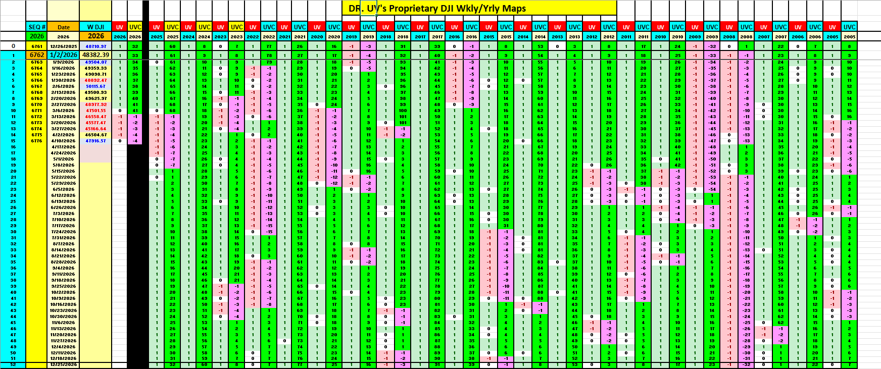
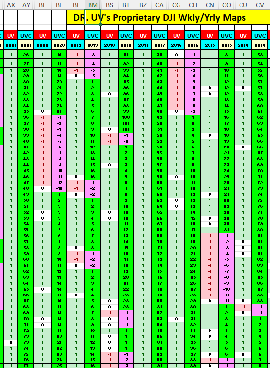
The image below is a single screenshot from my UV Maps spreadsheet. It displays 20 years of weekly Dow Jones data (2005–2024) mapped against just two columns from my indicator system: UV and UVC.
That’s it. Two numbers per week. One screen. Two decades of market history — including every major crash, correction, and rally the market has thrown at us.
What Are UV and UVC?
If you’re new here, a quick refresher. (For the full breakdown, see my Complete Indicator Guide.)
UV is a weekly signal with three states:
+1 (bullish) — the model says stay long, the trend is in your favor
0 (neutral) — the model is transitioning, reduce exposure
-1 (bearish) — the model says step aside, risk is elevated
UVC is the cumulative UV counter. It tracks how long you’ve been in a given regime. A UVC of +40 means 40 consecutive weeks of bullish signal. A UVC of -12 means 12 consecutive weeks of bearish signal. The higher the absolute UVC, the stronger and more persistent the trend.
Together, UV and UVC give you two things most indicators can’t: direction and conviction.
The Return on Time Invested (ROTI)
Let’s talk about what makes this different from the hundreds of indicators, newsletters, and trading systems out there.
Most systems demand constant attention. Daily chart reviews. Intraday alerts. Earnings analysis. News monitoring. Hours of work every week — and still no guarantee you’re on the right side of the market.
The UVC model asks for less than one minute per week.
Every Friday after the close, you check two numbers: UV and UVC. That’s your entire decision framework. If UV is +1, you stay invested. If UV flips to -1, you step aside. If it’s 0, you reduce and wait.
The Return on Time Invested — what I call ROTI — is off the charts. No other system I’ve seen delivers this level of signal clarity with this little time commitment. You’re not staring at screens. You’re not second-guessing every headline. You’re checking two numbers once a week and acting accordingly.
20 Years of Proof: What the Map Shows
Now let’s walk through what the UV Map reveals across two decades. The patterns are unmistakable.
2008: The Global Financial Crisis
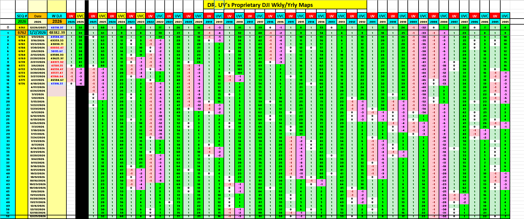
This is the one everyone asks about. The DJI started 2008 at 12,800 and ended at 8,516 — a 33.5% loss. The DJI’s absolute low that year hit 8,046.
But look at the UV column for 2008. It reads -1 for 45 out of 52 weeks. The model went bearish at the very start of January 2008, with the DJI still above 12,800. It actually first flagged caution back in November 2007 (UV flipped to -1 on Nov 16, DJI at 13,177) before a brief recovery and then the decisive -1 at the start of 2008.
If you followed the signal, you were out of the market for virtually the entire crash. The UVC column tells the rest of the story — it counted down relentlessly: -1, -2, -3… all the way into the -40s. No ambiguity. No “maybe it’s a dip.” Just a persistent bearish count week after week.
While buy-and-hold investors lost a third of their portfolio, UV subscribers were on the sidelines.
2009: The Recovery Signal
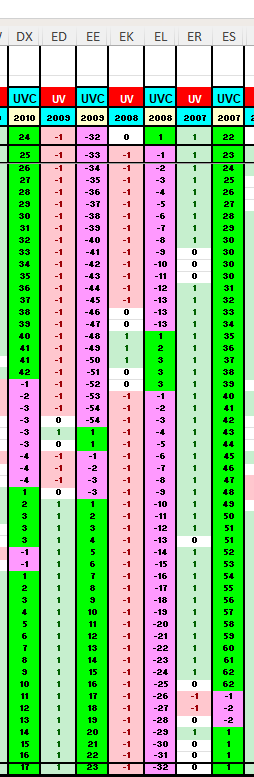
2009 was a transition year — the model showed UV at -1 for 25 weeks and +1 for 25 weeks. It didn’t blindly call the bottom the day after the March low. It waited for confirmation, then flipped to +1 and caught the bulk of the recovery rally. The DJI went from 9,035 to 10,428 that year, and the model was positioned long for the second half of that move.
2013 and 2017: Full Bull Runs
Look at the UV columns for 2013 and 2017. They are almost entirely green. In 2013, UV was +1 for 50 out of 52 weeks. In 2017, it was +1 for all 52 weeks — a perfect bullish year with zero interruptions. The DJI gained 22.7% in 2013 and 23.8% in 2017. The UVC counters climbed steadily all year long, confirming sustained bullish momentum.
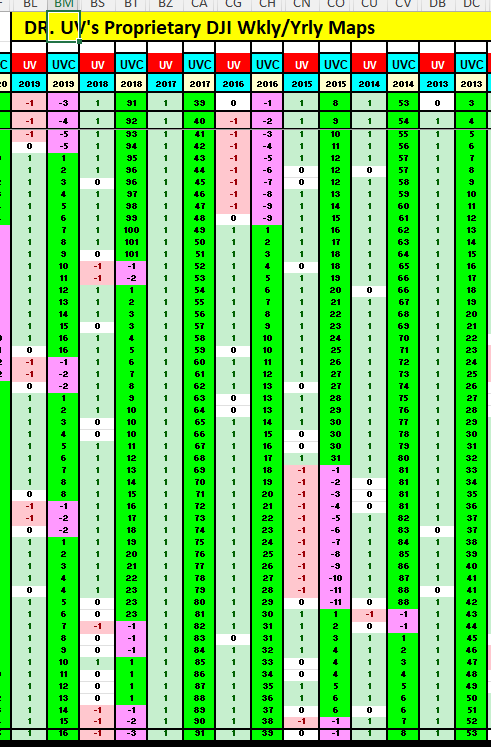
These are the years where the model tells you to stay fully invested and not get shaken out by noise. The persistent +1 signal with a rising UVC count is your confirmation that the trend is healthy.
2020: COVID Crash and Recovery
February 28, 2020 — the DJI drops from 29,398 to 25,409. UV flips to 0 (neutral). The very next week, March 6 — UV goes to -1 with the DJI at 25,865. The model got you out before the real carnage.
Over the next 12 weeks, UV stayed at -1 while the DJI plunged to a low of 19,174 on March 20. The UVC counter ticked: -1, -2, -3… -12. Then by late May, UV shifted to 0 and eventually back to +1, catching the recovery.
The year ended up +6.9% for buy-and-hold investors. But the experience was radically different for UV followers — they avoided the gut-wrenching 33% drawdown from peak to trough and re-entered on the model’s terms.
2022: The Stealth Bear Market
2022 was tricky. No single dramatic crash — just a grinding, frustrating decline that caught many investors off guard. The DJI went from 36,232 to 33,147, an 8.5% loss.
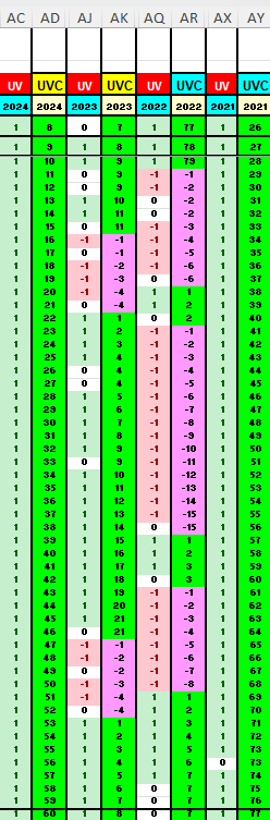
UV told a clear story: -1 for 29 out of 52 weeks. The model flipped bearish on January 21 with the DJI at 34,265 — just three weeks into the year. It cycled between bearish and brief bullish signals throughout, but the dominant message was clear: this is not a market to be fully invested in.
The Big Picture: 20 Years at a Glance
Here’s the summary across two full decades:
In every major down year (2008, 2022), UV was predominantly -1 — keeping you out of the worst of it
In every major up year (2013, 2017, 2021, 2024), UV was predominantly +1 — keeping you in for the ride
In crash events (2008 GFC, 2020 COVID), the -1 signal came early, not after the damage was done
In recovery phases (2009, late 2020), the model patiently waited for confirmation before going +1
2017 and 2024 were perfect UV years — +1 for all 52 weeks. 2013 was nearly perfect at 50 out of 52. 2021 was +1 for 51 out of 52. These are the years where the model’s message is simple: stay invested, don’t overthink it.
Why This Matters
There are two ways to manage a portfolio:
Spend hours every day analyzing charts, reading news, watching CNBC, following 15 different indicators, and still second-guessing every move.
Spend one minute every Friday checking UV and UVC, and act on a system that has been backtested across 130 years of market data.
I built the UVC model because I wanted option 2 — not just for myself, but for anyone who wants to participate in the markets without making it a full-time job. The UV Map you see in the screenshot is the proof that it works. Not a backtest on paper. Not a hypothetical. Twenty years of real market data with a clear, unambiguous signal every single week.
Less than a minute a week. Maximum ROTI.
What’s Next
This post focused on the weekly DJI using just UV and UVC. But the full model goes much deeper — UVCBI for momentum, UVCKEY for composite scoring, UVCTS for trend strength, and UV Maps that extend back to 1896.
In upcoming posts, I’ll be expanding this analysis to show:
How the full 130-year UV Map tells the story of every major market cycle from the 1900s through today
How the same model applies to the NDX, individual sectors, and crypto
How to use UVC thresholds for position sizing — not just direction, but how much to allocate
If you found this useful, share it with someone who’s tired of overcomplicating their investment process. And if you’re new here, start with the Complete Indicator Guide to understand the full system.
One screen. Two numbers. Twenty years. That’s the power of UVC.
=====
Post # 522
===
===
12. The Roadmap: What Is Coming
NDX UV Map: 40 years of NASDAQ daily signals -- the deepest trend archive ever built with UV
SPX and DJI: 120 years of market history compressed into 2 screens with horizontal scrolling
Multi-Timeframe Position Sizing Screens: 1hr, 2hr, 4hr, 1D through 5D on a single screen
Cross-Asset UV Maps: 38 tickers from the Master Tracker, all visualized with signals as a function of time
Expanding Dashboards: SOXX33, SS36 Sectors, MAG20, Crypto, Data Centers
Historical comparison mode: Overlay today’s signals vs. any prior date
Custom portfolio view: Build your own ticker list, get instant dashboard
Every asset, every timeframe, one consistent lens.
Read the full Roadmap post (Post #497) →
13. Indicator Reference Table
UVCMI | Foundation model | The original multi-timeframe trend engine. Color-coded profiles from 60 closing prices.
UVCBI | Momentum engine | Where is the thrust? Simplified breadth for any asset, any timeframe.
UVCTS | Trend memory | How committed is the trend? Duration and persistence, quantified.
UVCKEY (UK) | Signal regime | What state is the market in? Seven dimensions in one integer (-100 to +100).
UVCCI | Composite synthesis | Should I be in or out? Fuses UVCBI + UK + UVCTS + price dynamics.
UV | Current state | Is the market on (1), neutral (0), or off (-1)?
UVC | Cumulative path | How has that state evolved through time?
UV Maps | Historical visualization | Where does the current signal sit inside the bigger market story?
The Hierarchy: From Maps to Signals to Sizing
Layer 1 -- UV Map: Trend visualization (what you see)
Layer 2 -- UV Signals: Proprietary entry/exit rules
Layer 3 -- Position Sizing: Dynamic allocation based on signal strength and risk profile
“The map is the terrain. The signal is the route. The sizing is the vehicle.”
14. Source Posts & Further Reading
This guide was compiled from the following foundational posts. Click any link to read the full post:
Post #440 -- UGA...Unveiling Dr. UV’s Profit Tracker UVCBI Signal Caller (Mar 9, 2026)
Post #475 -- Unveiling Unique Universal Ultimate UVCKEY (Mar 20, 2026)
Post #479 -- Unveiling the UVCKEY Signal Dashboard (Mar 23, 2026)
Post #486 -- Unveiling Ultimate Unique Universal UVCCI (Mar 26, 2026)
Post #491 -- UVCCI..Simplest Visualization of Signal Trading (Mar 30, 2026)
Post #494 -- That’s All You Need to Know 1 0 -1 (Mar 31, 2026)
Post #496 -- How to Squeeze 15 Years of Signals in One Screen (Apr 1, 2026)
Post #497 -- Evolution and Future Direction of Dr. UV’s Model (Apr 1, 2026)
Post #499 -- BTC: One Signal, 5 Timeframes -- UV as a Position-Sizing Engine (Apr 1, 2026)
Post #501 -- Unveiling UVC Maps: QQQ, SOXX From 2020 (Apr 2, 2026)
Post #502 -- BTC UV Map: A Decade of Bitcoin Through the UV Lens (Apr 2, 2026)
Post #503 -- From UVCMI to UV Maps: The Journey to a Visual Market Operating System (Apr 2, 2026)
(c) 2026 Dr. UV. All Rights Reserved. Proprietary and Confidential. Do Not Reproduce.
Disclaimer: Dr. UV’s analysis is for informational purposes only and does not constitute financial advice. Past performance does not guarantee future results. UVCCI is a research and trend-visualization tool, not a standalone trading system. Always manage risk appropriately.